Case study
OpenHome
Led UI design and visual direction, aligning the app experience with the CEO's vision and product goals.
View hi-fi prototype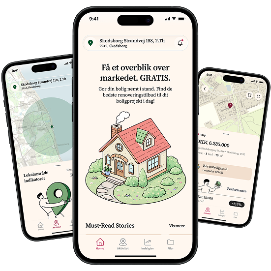
The brief
Owning a home comes with a lot of data, but very little clarity.
OpenHome helps homeowners understand their property through clearer valuation, market, local-area, and documentation tools.
When I joined the project, the founder had already defined a strong product direction, but the experience still felt fragmented. Property data, renovation history, documents, images, and market activity were spread across different mental models, making it harder to understand what the app was for and why users should return to it.
My role was to turn those scattered ideas into a clearer mobile product: revising the information architecture, strengthening the visual identity, and prototyping insight-driven features that made OpenHome easier to understand, explain, and scale.
Problems
- Lack of product clarity: The app had valuable features, but the structure did not clearly communicate what OpenHome was, what users could do with it, or why it mattered.
- Fragmented information: Documents, receipts, images, renovation history, and property data are often spread across emails, folders, portals, and memory.
- Property value without context: A valuation number alone is not enough. Users need to understand what influences it and how their local market is changing.
- Low ongoing engagement: Most property platforms become relevant only when people buy or sell. OpenHome needed a reason for homeowners to come back regularly.
Screenshots from the original OpenHome prototype interface, before I started working on the product.
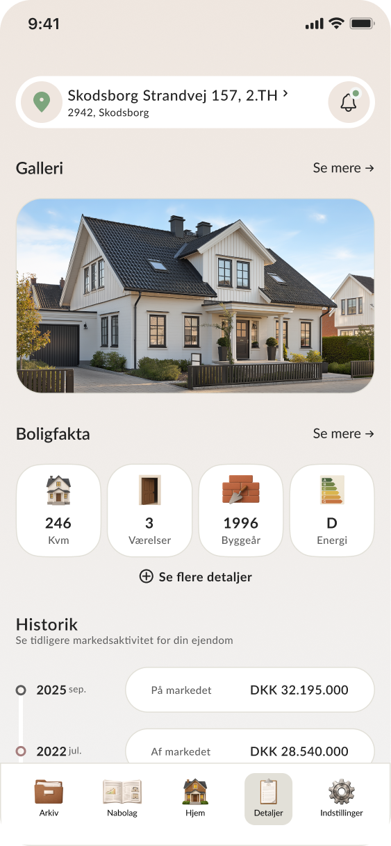
Information Architecture Revision
The initial structure mixed several product ideas: a property dashboard, a local market feed, valuation tools, service offers, and a document vault.
I revised the information architecture to separate the main areas of value and give the app a stronger mental model.
Key changes
- Reframed the app around four core areas: Home, Local Area, Insights, and Vault
- Separated market activity from property insights
- Moved documentation into a clearer Vault section
- Made the product easier to scan, explain, and scale
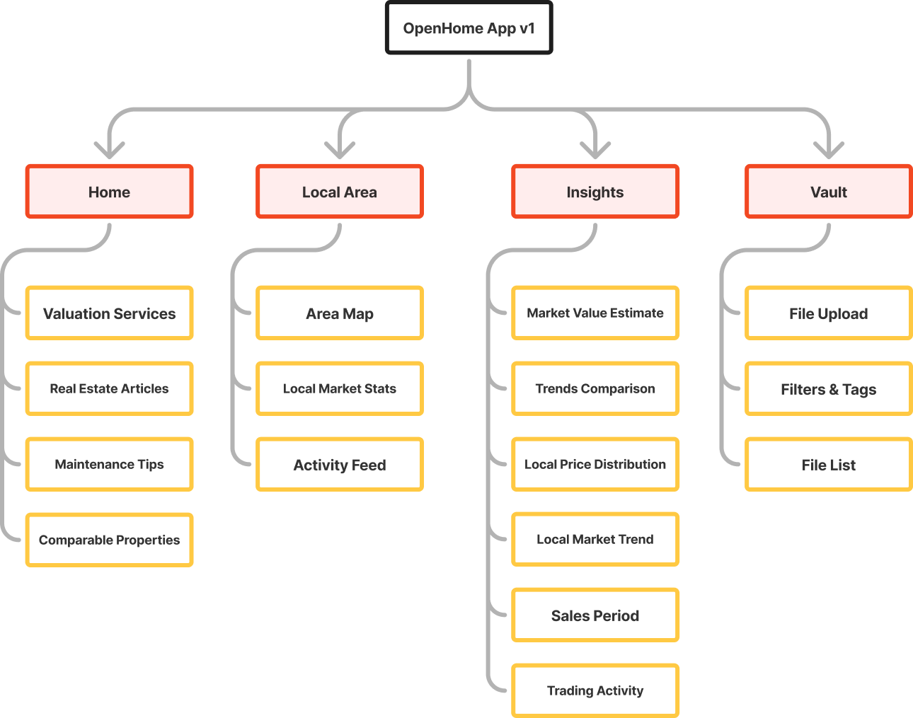
My revised information architecture for OpenHome.
Visual Design Revision
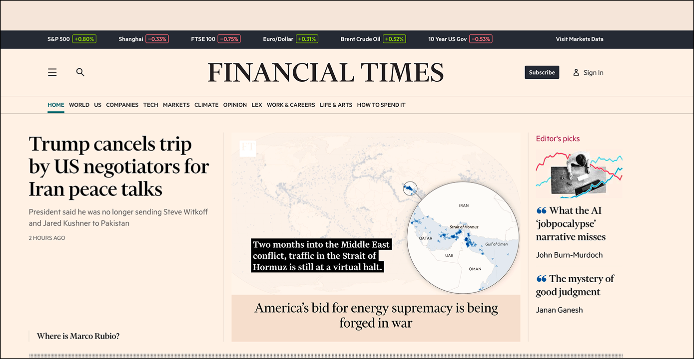
The original brand direction had potential, but it was not expressed boldly or consistently enough.
I pushed the editorial and financial aesthetic further, using references such as Børsen and Financial Times to create a more distinctive product identity.
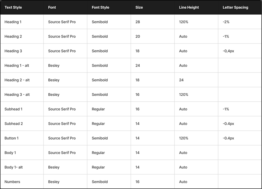
Design system work
- Rebuilt the color system from scratch
- Defined a clearer typography direction
- Created a coherent icon and illustration style
- Established reusable visual rules for cards, graphs, labels, and data-heavy sections
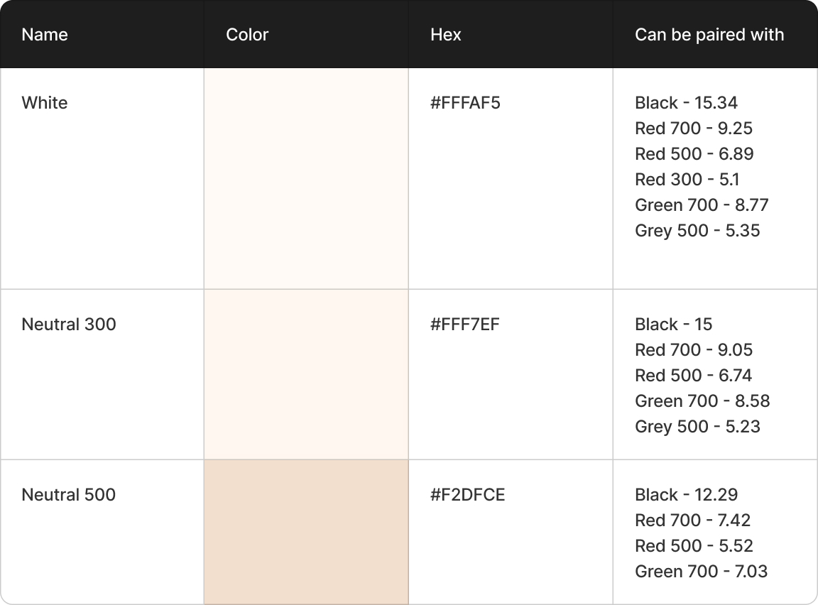
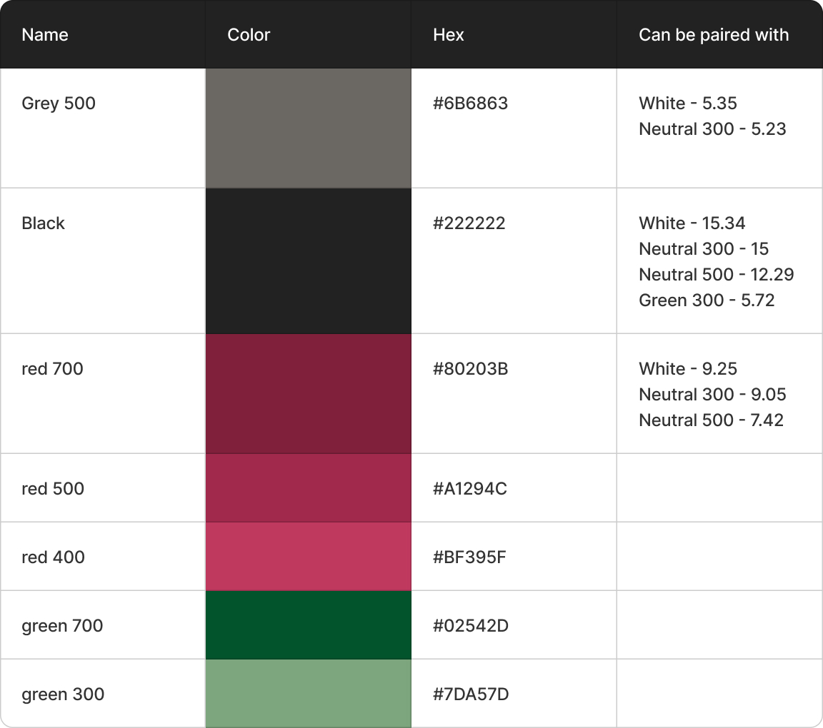
Screenshots from the revised design system, including visual references, color direction, and typography choices.
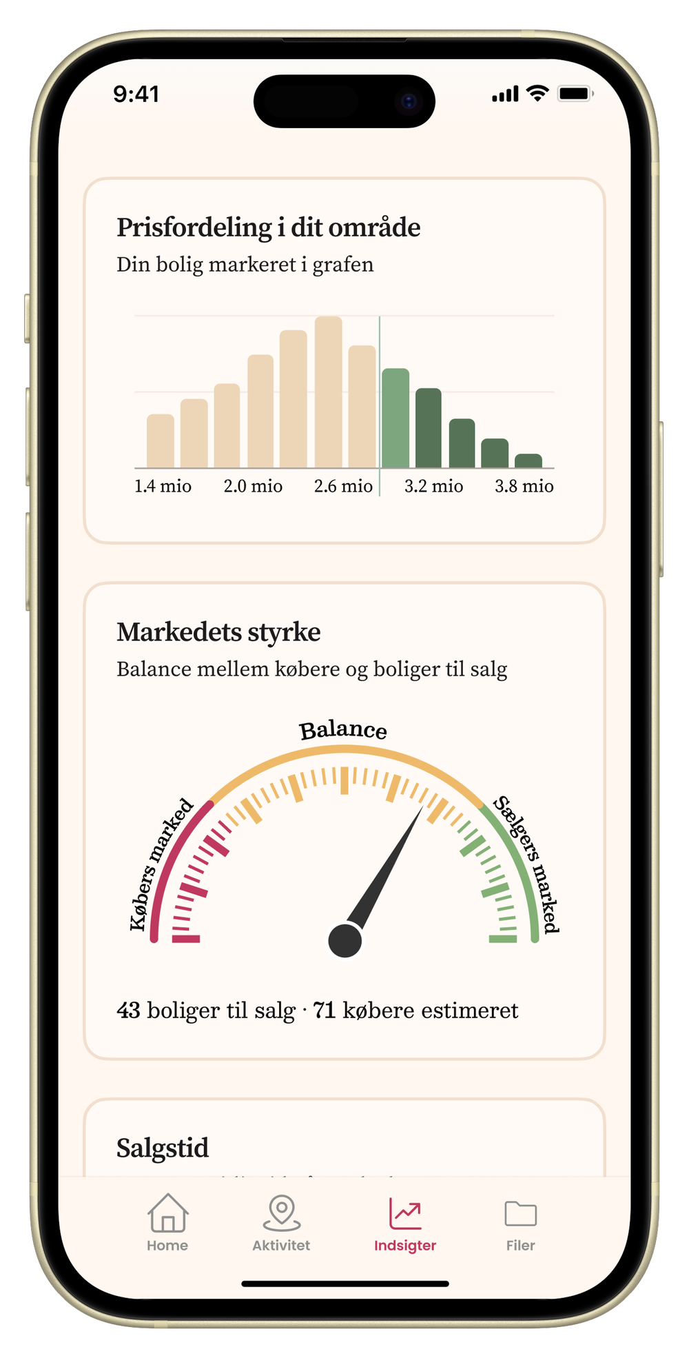
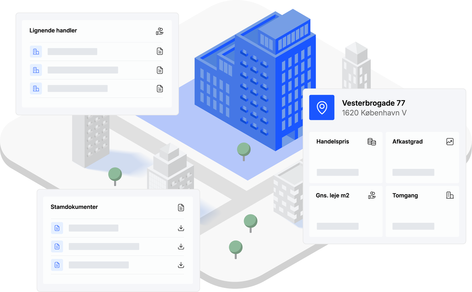
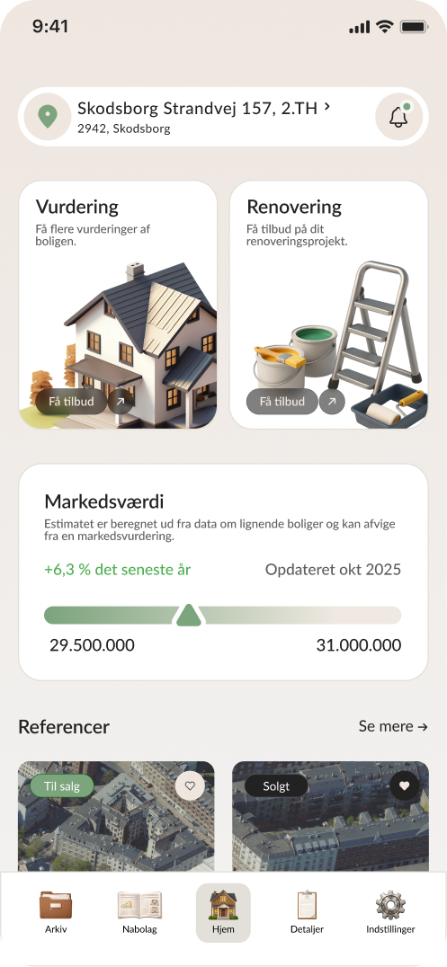
Insights Feature
Together with the CEO, I explored a new product direction focused on helping homeowners feel more informed and in control of their property.
The Insights section translates complex property and market data into clear visual signals.
Feature highlights
- Property value estimate with range and trend indicators
- Market development graph
- Local price distribution
- Market strength indicator
- Sales time and trading activity cards
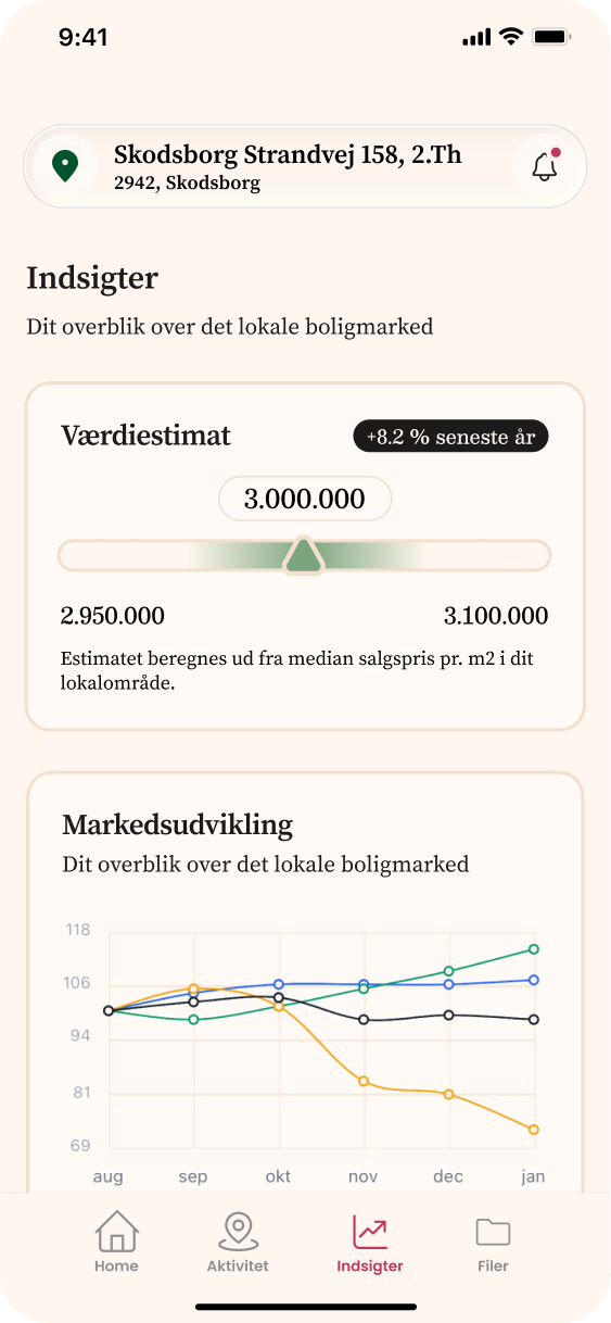
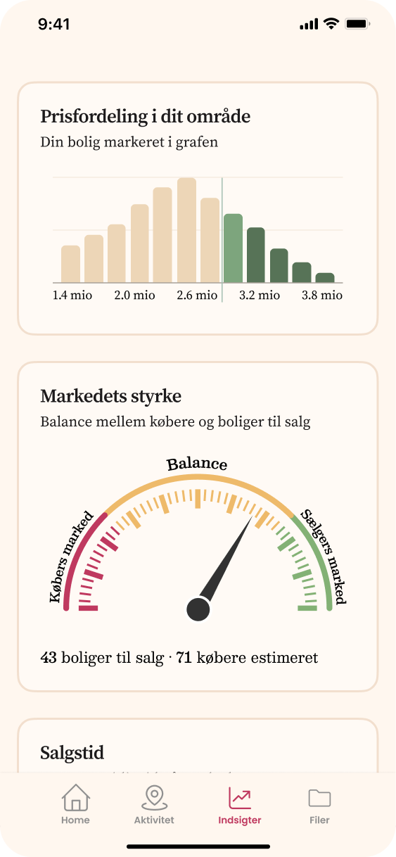
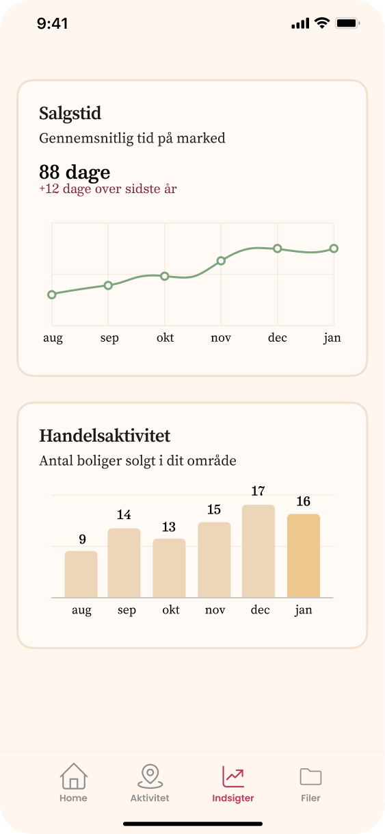
Three screens from the new Insights page, designed to make property and market data easier to read.
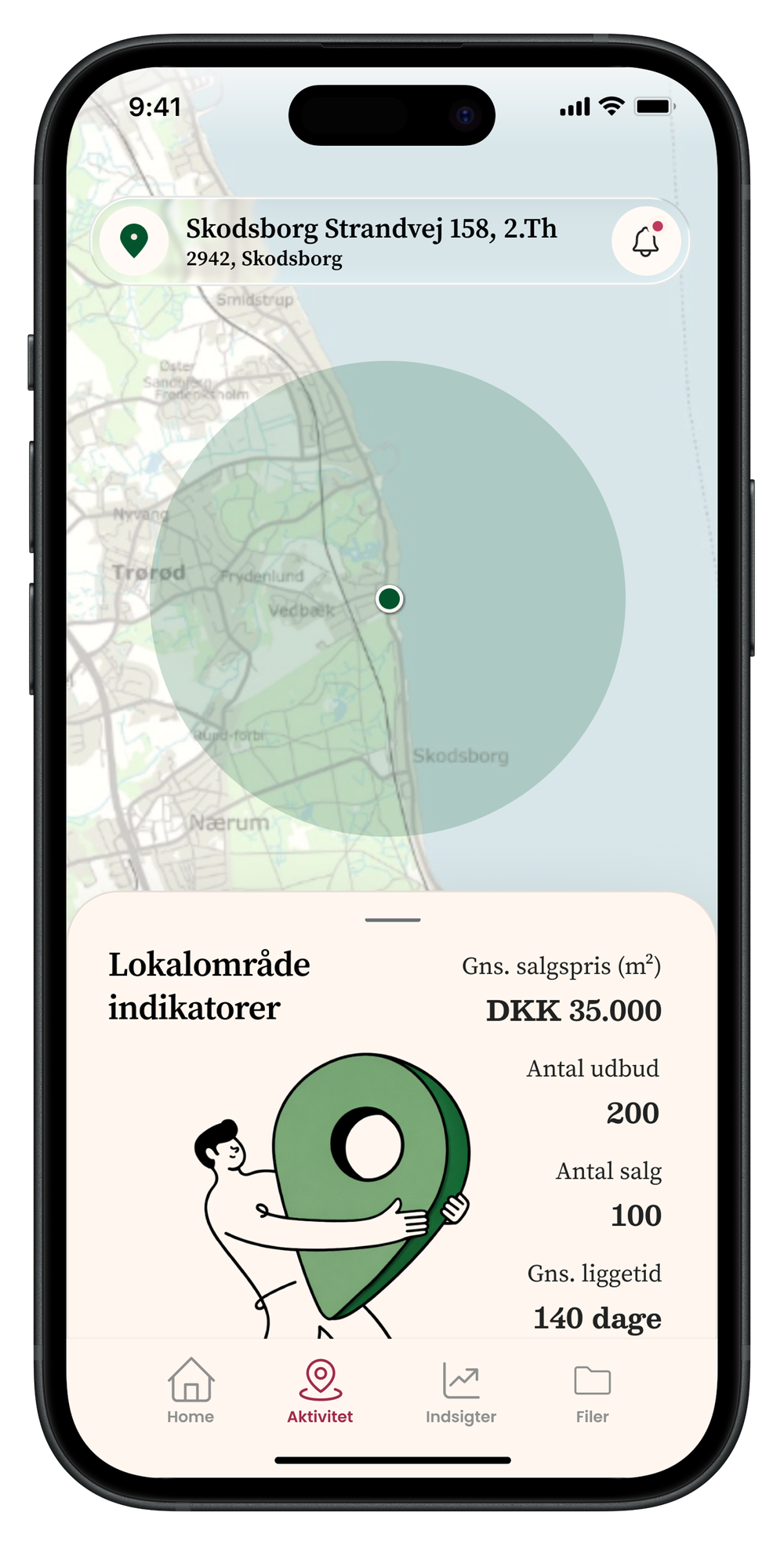
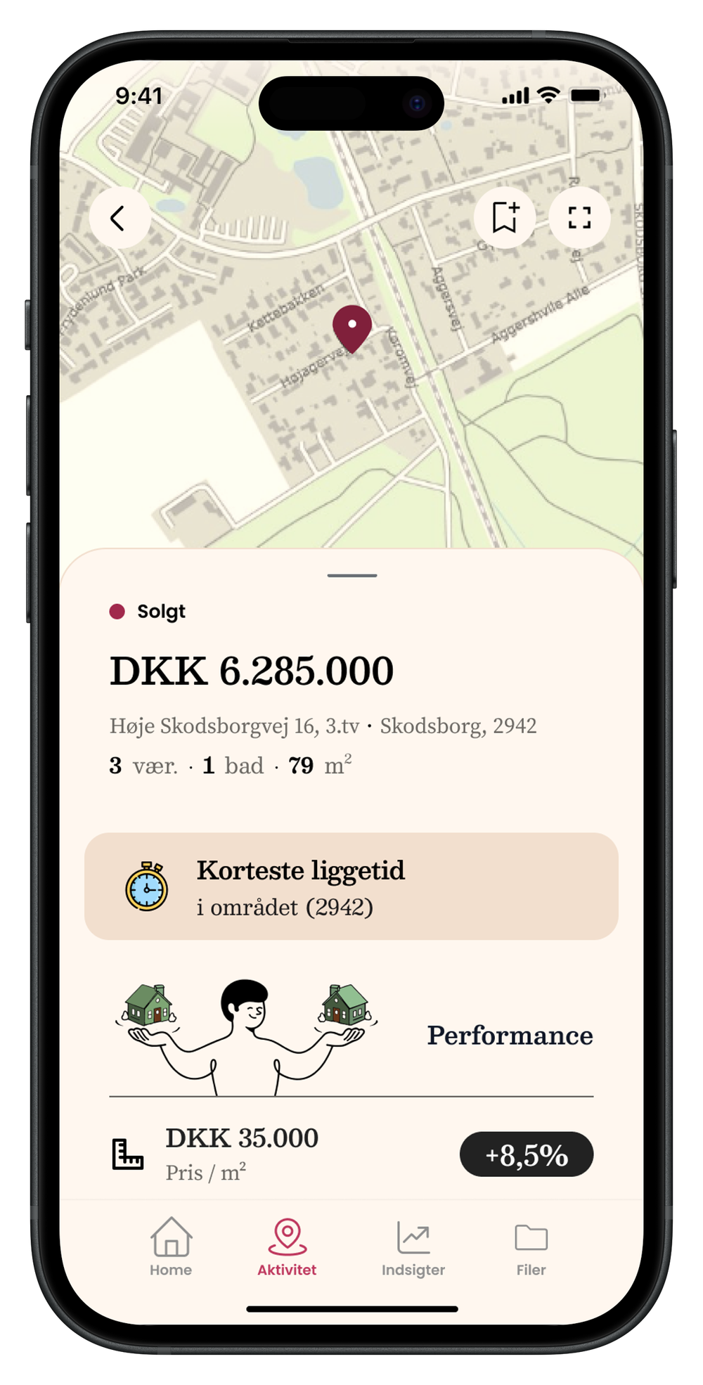
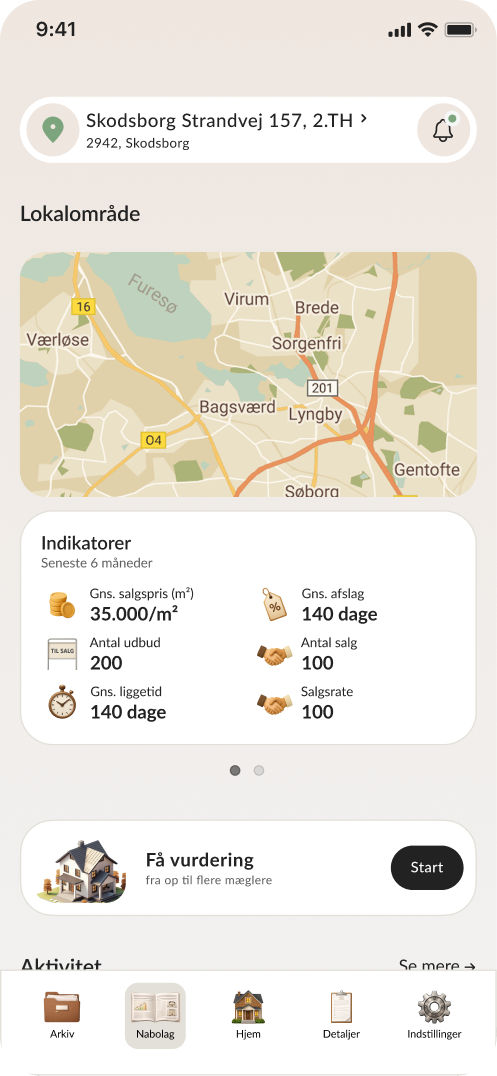
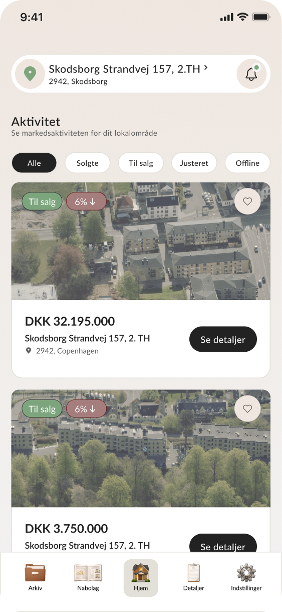
Local Area Feed
I designed and prototyped a local area experience that gives homeowners a clearer view of what is happening around them.
The feed combines map-based exploration, local property activity, and lightweight market stats to make the surrounding housing market easier to understand.
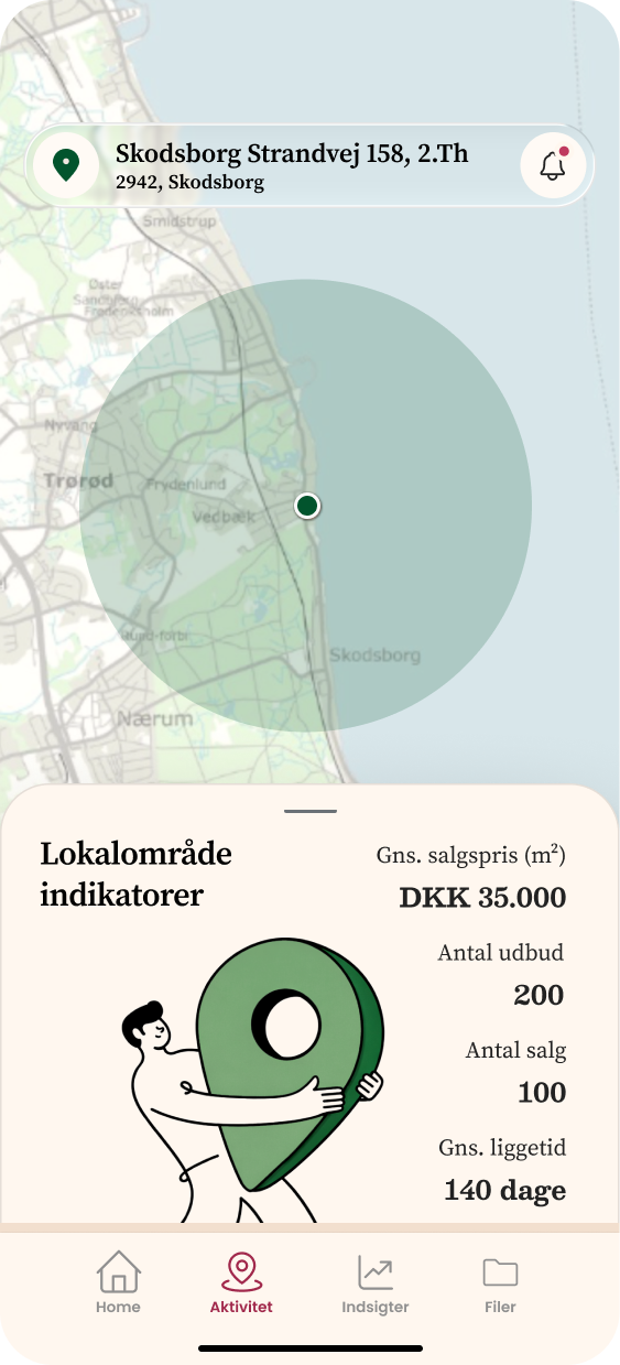
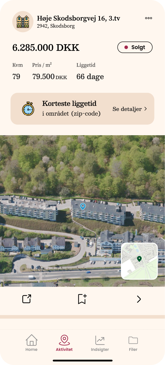
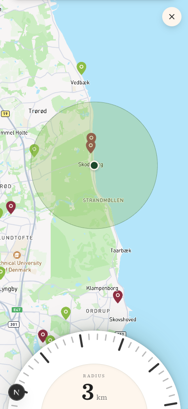
New Local Area Feed screens showing the map, property activity, and local market context.
Prototype work
- Fully functional prototype
- Map-based local area interaction
- Real-time filtering
- Lightweight JSON-based fictional database
- Infinite-scroll simulation
What the Prototype Revealed
The prototype helped make the product direction more tangible and easier to discuss with stakeholders.
Key learnings
- The local feed immediately felt like a strong direction for recurring engagement
- The visual redesign was positively received and made the product feel more coherent
- The Insights section opened an important product question around which data is most meaningful for homeowners
Next Steps
- Connect the prototype to real data
- Validate the product direction with homeowners
- Test whether users understand the insights without explanation
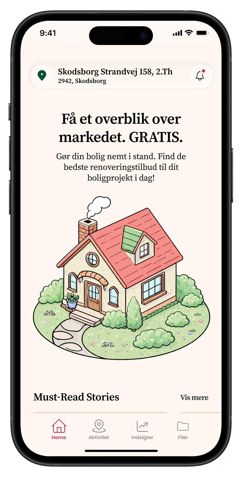
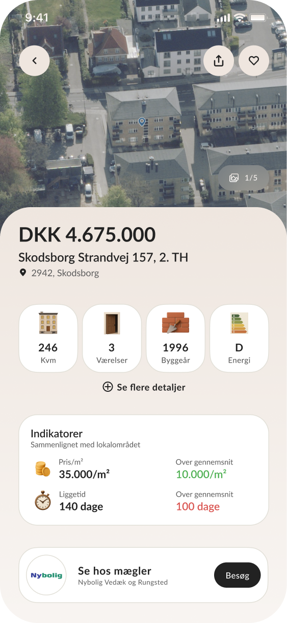
Final Interface
The final result is a cohesive mobile experience that balances clarity, personality, and data accessibility.