

OpenHome is an app that helps homeowners understand and manage their property through clear insights.
Led UI design and visual direction, aligning the app experience with the CEO’s vision and product goals.
Project Type: End-to-end app.
Role: Sole UX/UI designer in collaboration with OpenHome founder.
Industry: Real estate / Investments
Tools: Figma, FigJam
Duration: 3 months
The brief
“Owning a home comes with a lot of data — but very little clarity”
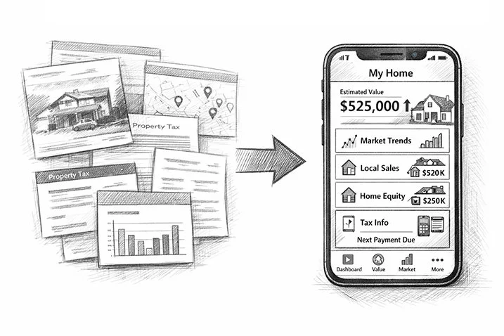
Homeowners have access to a large amount of property-related data, but it is often fragmented, difficult to interpret, and not designed for everyday use.
As a result, they struggle to understand their home’s value, follow market changes, and make informed decisions about their property.
Starting point
The product direction was already defined by the founder, who had validated key assumptions and outlined a feature set. My role was to translate this vision into a clear, usable interface and product experience.
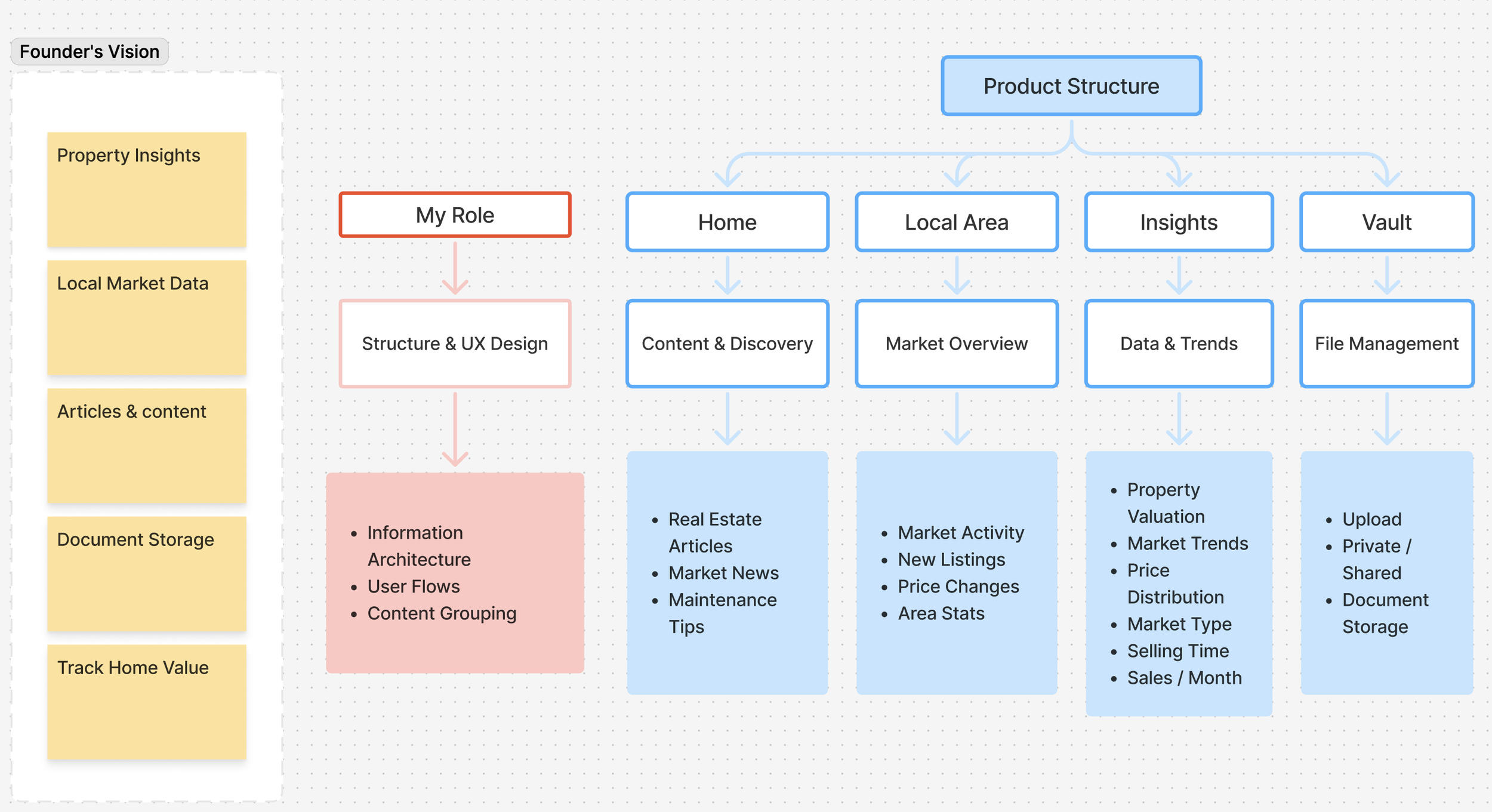
From Features to Experience
Instead of starting from scratch, I focused on structuring and designing the interface in Figma — turning a list of features into a coherent product experience.
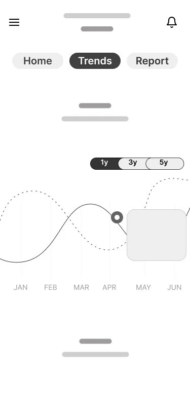
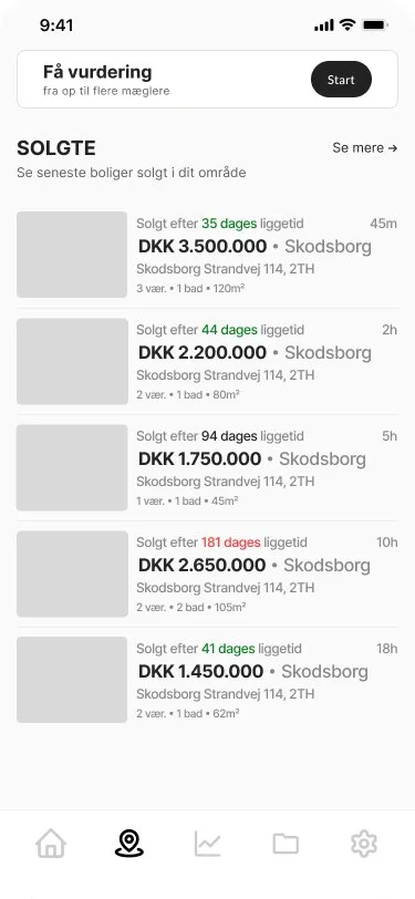
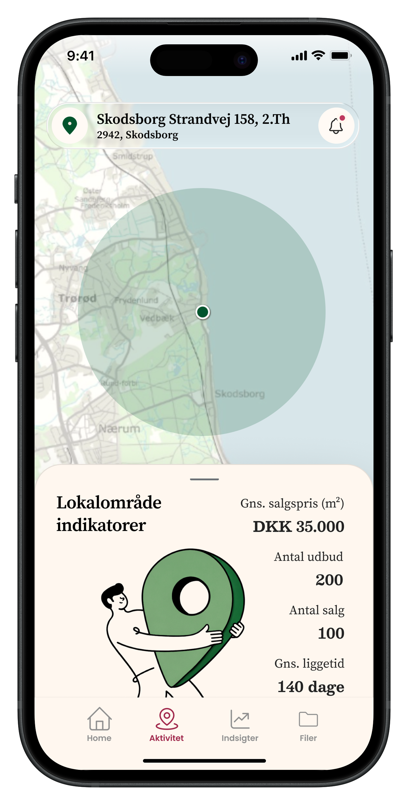
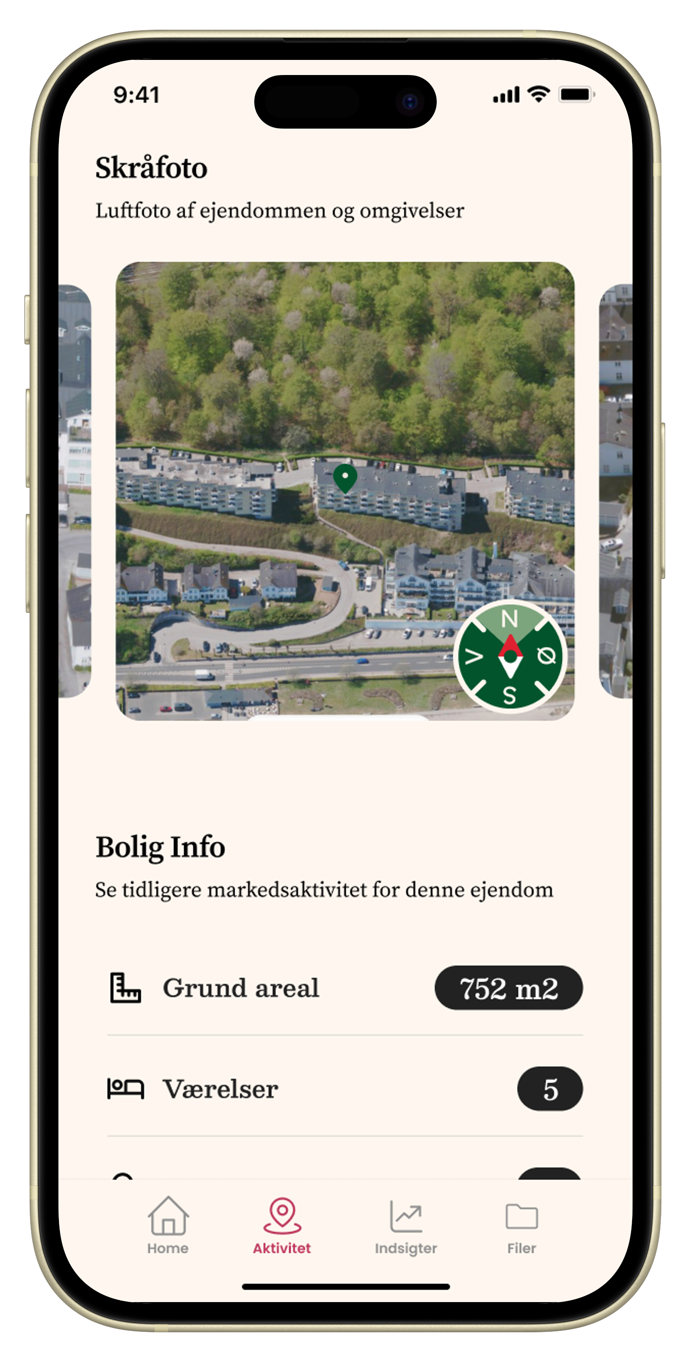
Designing the “Activity” Experience
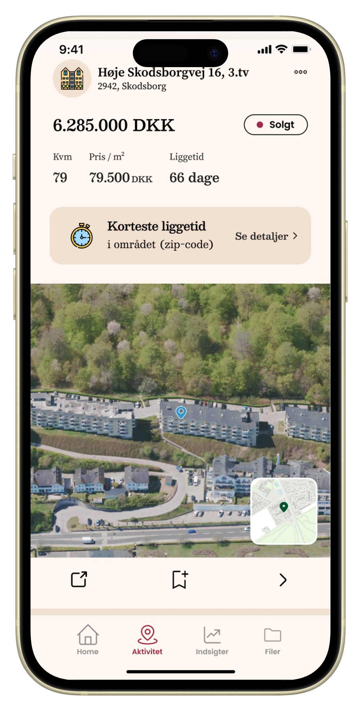
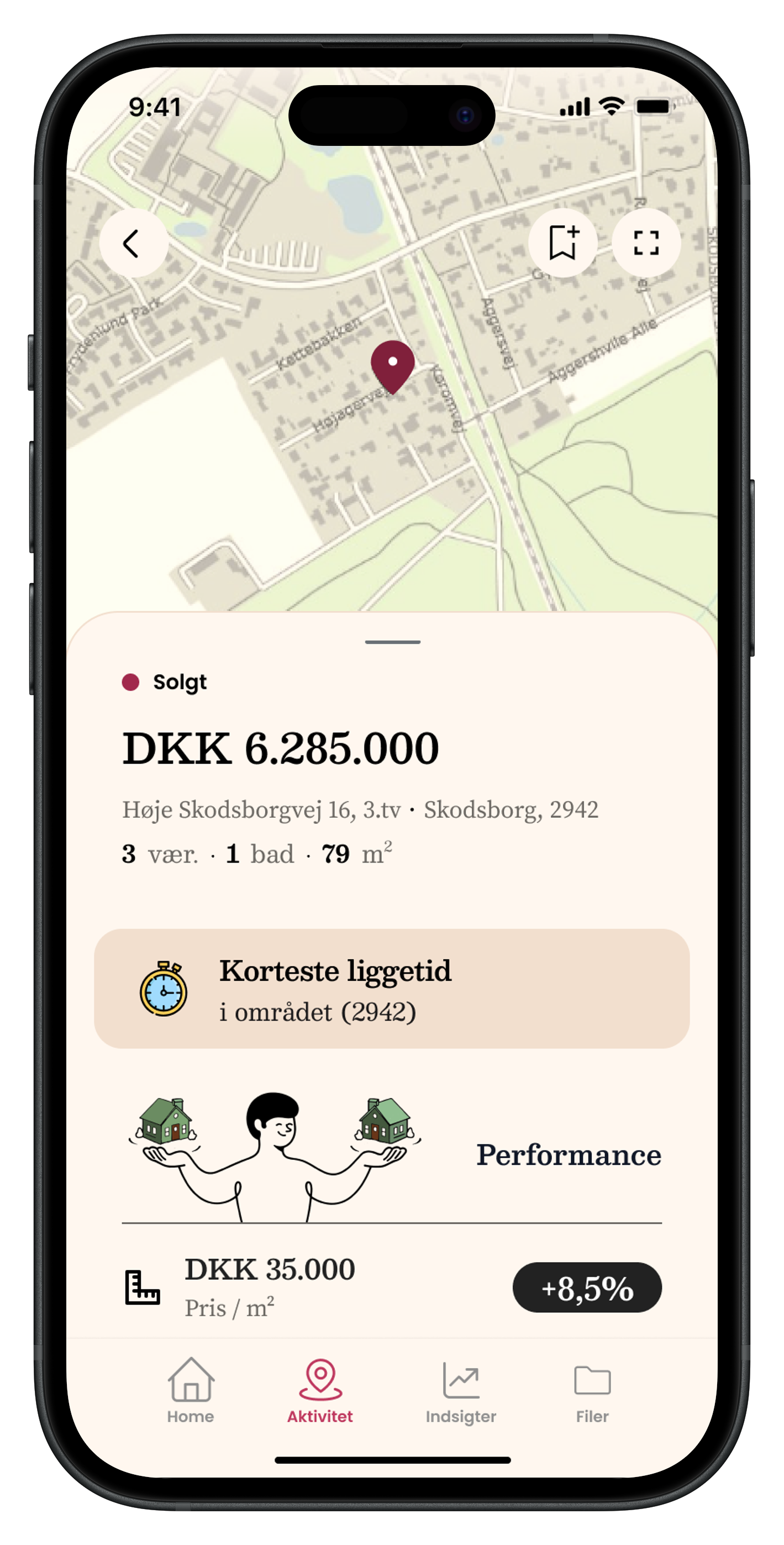
One of the key challenges was the Activity section, which initially lacked a clear purpose. Together with the founder, we reframed it as a local market feed, showing real-time events in the user’s area.
The feed surfaces:
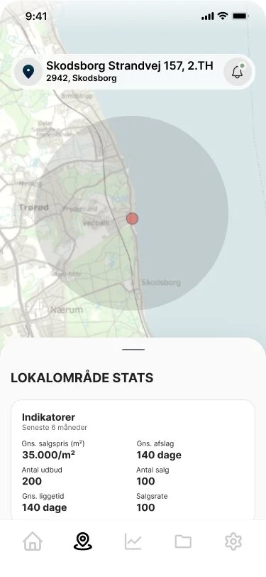
local market statistics
new properties on the market
price changes
sold properties
notable events (e.g. fastest sale, highest price)
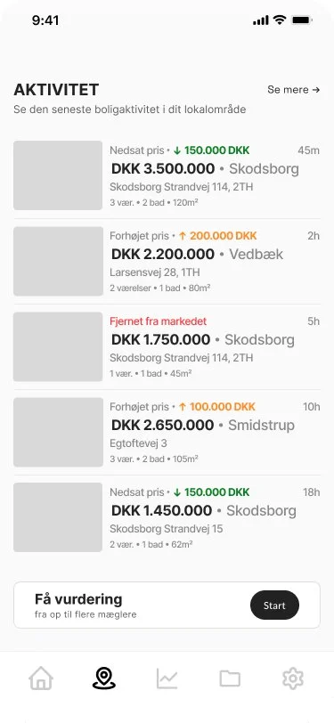
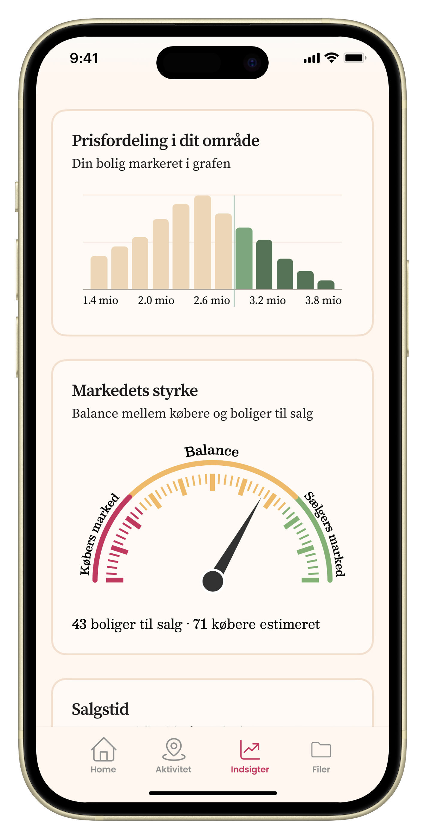
Inspired by platforms like Strava, the goal was to create a habit-forming experience that encourages users to return regularly.
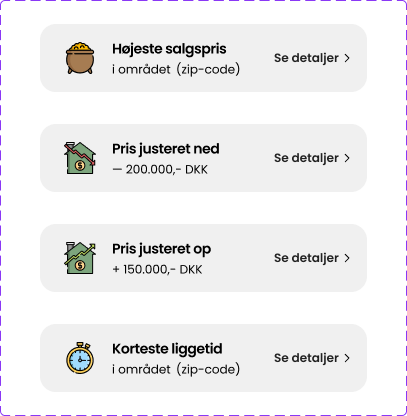
Driving Engagement Through Feedback
To reinforce engagement, we introduced lightweight “achievement-style” signals — highlighting exceptional events in the area.
This turns passive data into something more motivating and dynamic.
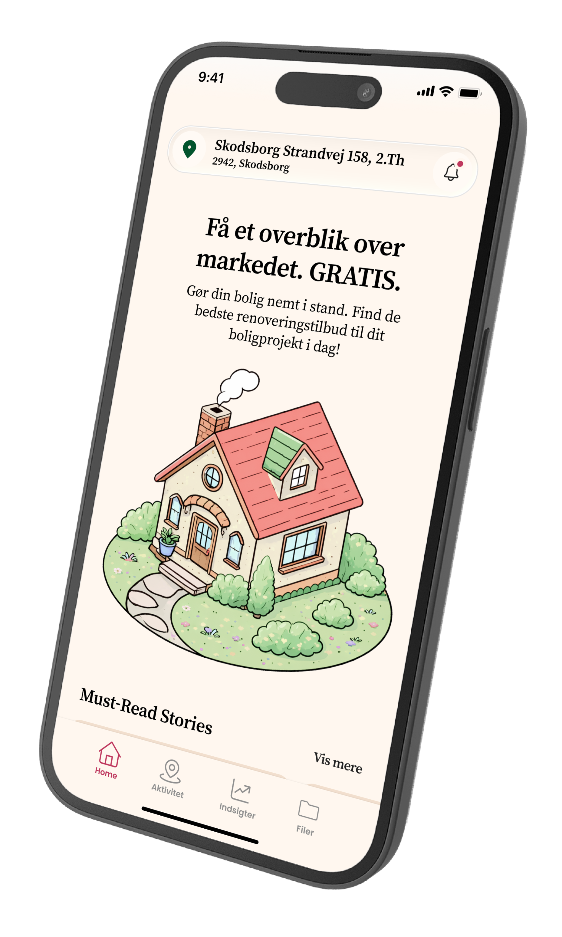
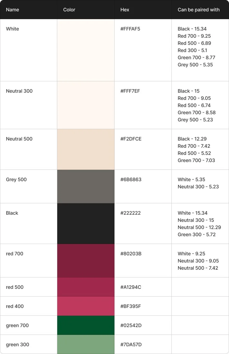
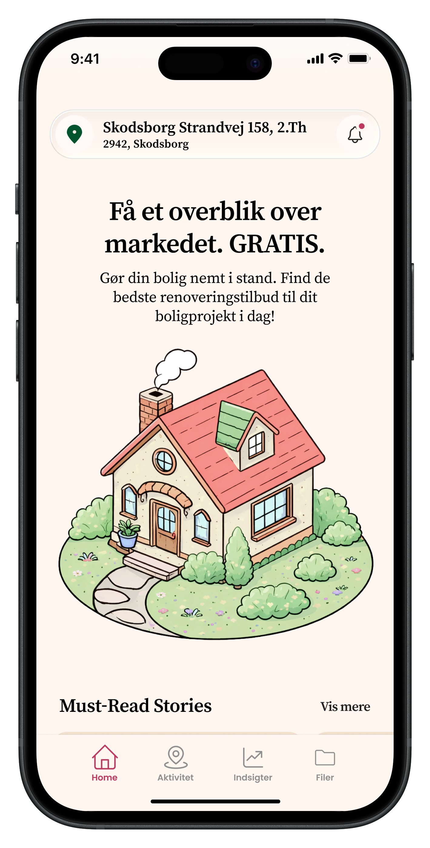
Visual Direction & Branding
The initial direction was a neutral, “techy” interface — familiar but generic.
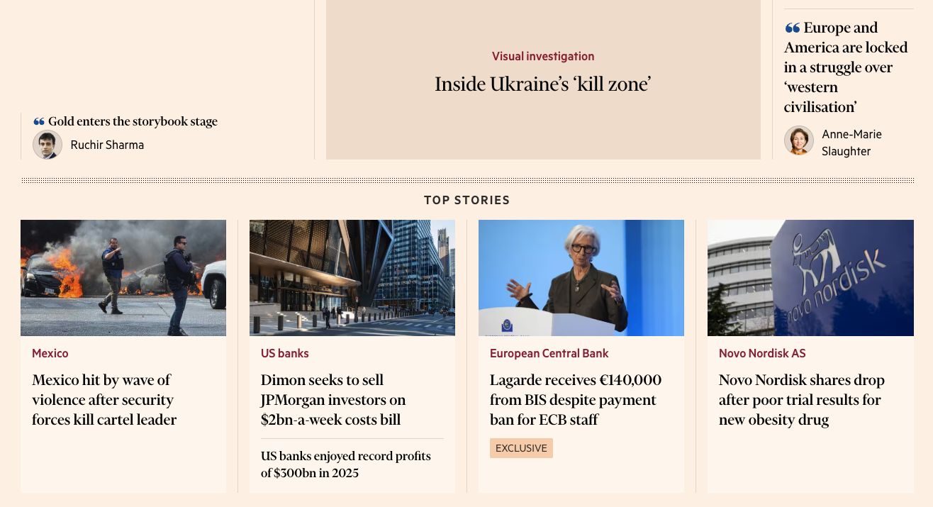
Through exploration and moodboards, we shifted toward a more distinctive direction inspired by editorial products like Financial Times.
This resulted in:
warmer, more characterful colors
strong typographic hierarchy
a more premium, trustworthy feel

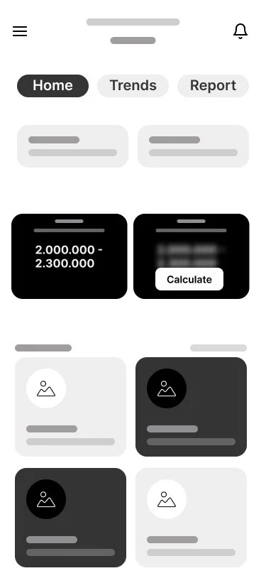
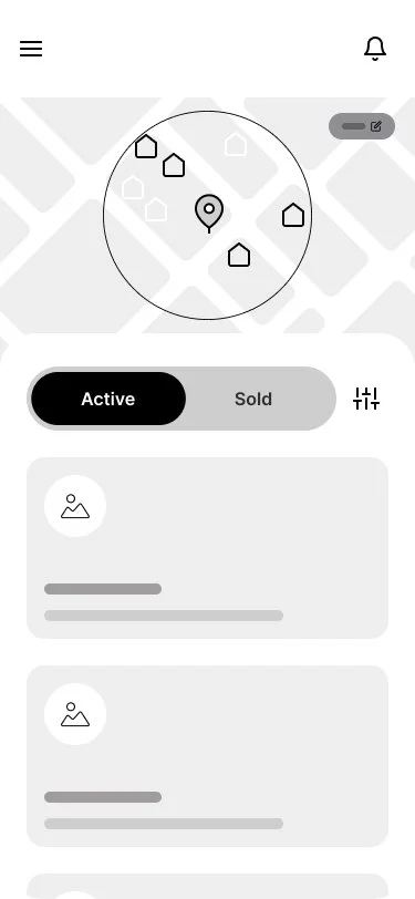
Final Interface
The final result is a cohesive mobile experience that balances clarity, personality, and data accessibility.
The high-fidelity prototype is currently being used by the founder for:
usability testing
investor presentations
This phase is helping validate both the product direction and the overall user experience.